show logo design

I wanted the logo for the show to visually demonstrate the concept of "work in progress" in a bold, clear way, so I made use of loading bars as elements in which to house the type. Such a bold logotype also lends itself to experimenting with different colours and textures to keep the identity feeling fresh, but always distinct.
woke in progress
In early 2020, Showmax planned to launch a bold, original comedy-drama for South African Gen-Z viewers, addressing themes like race, gender, and politics.
The team was tasked with naming the show and creating a full marketing campaign, including logo design, video promos, and street murals in collaboration with famed illustrator and street artist Yay Abe.
Although production was eventually halted, the marketing materials were completed.
Agency: Showmax In-House

Teaser social content
Building up to the launch of show, we wanted to flood our social channels with glitchy gifs to create intrigue around, and tease our main character's more quirky personality traits.
unfinished mural promos
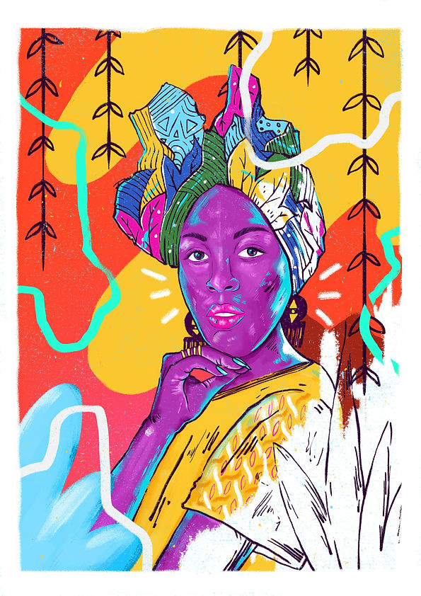
Woke in Progress is set in Johannesburg's urban creative hotspot of Maboneng. The area is extremely well known for the colourful street art covering the majority of the neighbourhood's walls. For this reason, we thought it would be apt to commission one of SA's most Insta-famous street artists, Yay Abe, to create murals of our two female protagonists. We used the artwork in promo content, where we show our street artist working on the murals, only to be interrupted by the realities of urban Johannesburg life, leaving them unfinished - a work in progress - much like the character's themselves, whose well-intentioned visions for themselves never go according to plan.

character-driven promo
We created TV promos that delivered on our primary characters' personality unexpected juxtapositions. In this instance the show's main character, Amandla, a very woke and empowered black woman, very much in touch with her South African roots, reveals herself not be able to speak any local languages (very un-woke) in a humorous way.
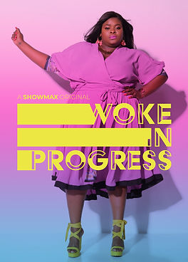
key art
Maboneng, where Woke in Progress is set, translates to "place of light". We took cues from the name of the location for our key art, using colourful washes of light sweeping over our show's characters. The result was stark, bold and eye-catching key art that would stand out in a busy billboard environment.